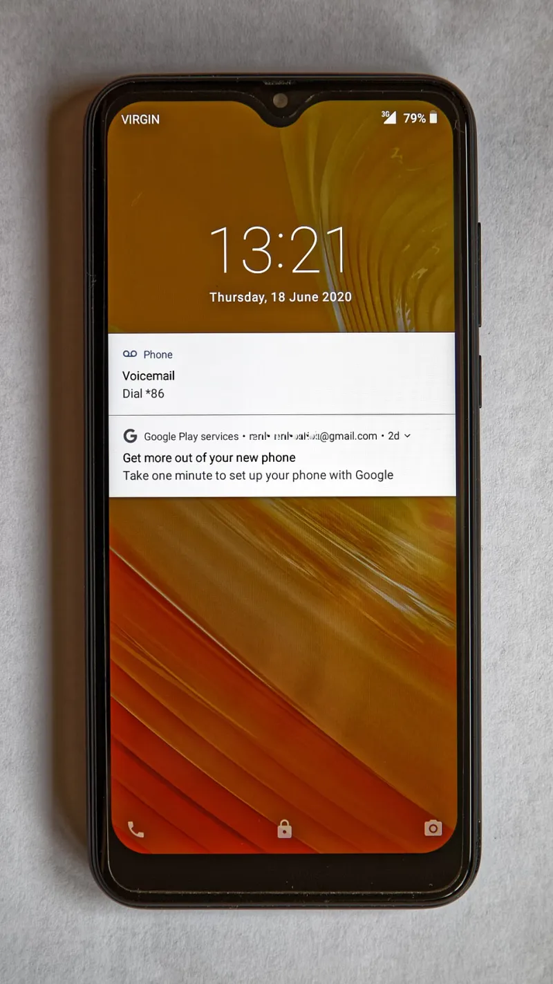
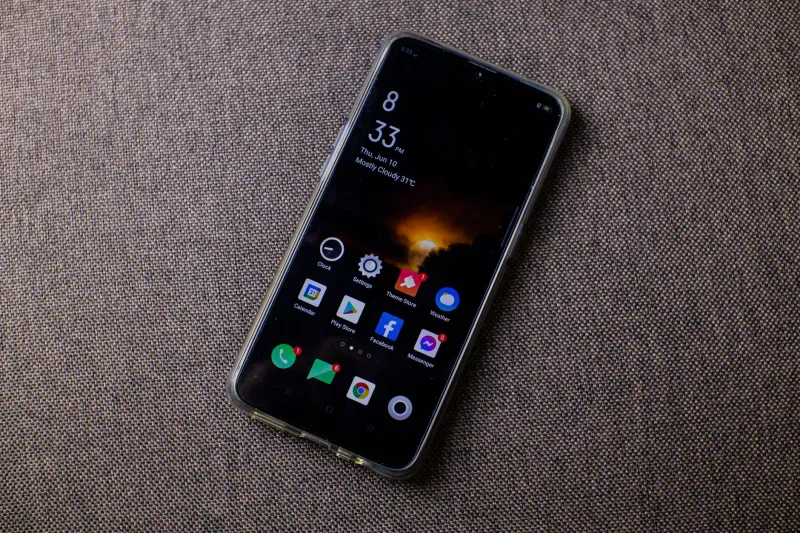
Glance, Don't Tap: How Widgets Turned My Home Screen Into a Dashboard I Actually Use
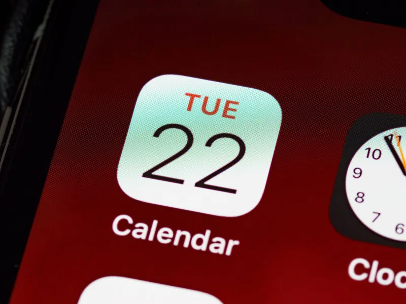
Be honest with yourself for a second. How many times today did you open the weather app, squint at a number, and swipe away? How about checking a calendar, a to-do list, or the score of last night's game? Each of those was a tap, a load screen, maybe a notification you didn't need waiting for you when the app opened.
There's a quieter way to run your phone, and it's been sitting on your home screen the whole time.
Widgets Grew Up While You Weren't Looking
For years, widgets were the participation trophies of the mobile world. On early Android they were clunky and battery-hungry; on iOS they didn't exist at all until 2020, and even then they felt like a party trick. You'd add a cute photo widget, get bored, and go back to your grid of icons.
That era is over. Both major platforms now support widgets that are interactive, resizable, and genuinely useful. You can check off a grocery item, pause a podcast, flip a smart light, or log a workout without ever seeing the inside of an app. The widgets of 2025 are less like stickers and more like tiny control panels.
And yet most Americans still use their home screen like it's 2013: a wallpaper, a clock, and forty identical little buttons.
Why Staying Out of Apps Is the Point
Here's the thing nobody says out loud about app design: the app wants your attention. Every time you open one, you pass through a lobby full of distractions — badges, banners, recommended content, that one notification designed to look like a message from a human. App developers call it engagement. You might call it a detour.
A widget skips the lobby. It shows you the one piece of information you came for and gets out of the way. No autoplay, no infinite scroll, no "while you're here."
That's not just a convenience thing — it's a wellness thing. The difference between glancing at your calendar on the home screen and opening the full calendar app is the difference between checking the time and falling into a rabbit hole. Widgets are, quietly, one of the best screen-time tools Apple and Google have ever shipped, precisely because they reduce the number of times you enter the apps where time goes to die.
The Widgets Worth Your Home Screen Real Estate
After a month of experimenting, here's the lineup that earned permanent spots:
Calendar (upcoming event). Not the full month grid — the big, single-next-event view. It answers the only question you ever actually have: what's happening next?
Weather (conditions plus radar). Skip the hourly forecast you'll never read. A combined current-conditions and radar tile tells you whether to grab a jacket in one glance.
Reminders or a to-do widget. Any list app worth using has one. Being able to check off "drop off dry cleaning" from the home screen removes the last excuse for opening the app and getting sucked into reorganizing your entire week.
A notes or pinned-note widget. Parking spot number, Wi-Fi password, that recipe your sister texted you. One sticky note on the home screen replaces a surprising number of app visits.
Media controls. Pause, skip, and see what's playing without pulling down Control Center. Small, but you'll use it constantly.
Battery widget. Boring, yes. But knowing your phone and earbuds are both at 60% before you leave the house beats discovering it in an airport.
Building Yours: A Five-Minute Setup
You don't need to redesign your entire phone tonight. Start here:
- Long-press an empty spot on your home screen until everything jiggles, then tap the plus button to browse widgets.
- Claim the top half of your main screen. Put your calendar, weather, and to-do widgets up top where your thumb doesn't have to travel.
- Use a second page for everything else. Move apps you don't open daily to page two. Out of sight, out of the tap-path.
- Add one interactive widget. Something you can act on directly — a smart home toggle, a timer, a grocery checkbox. That's the moment widgets click for most people.
- Audit after a week. Any widget you haven't glanced at in seven days gets deleted. Home screen real estate is like kitchen counter space — clutter it and you stop using it.
One tip for iPhone users: long-press a widget to check if it comes in multiple sizes. The medium and large versions usually show meaningfully more information, and the large calendar widget in particular is a genuine upgrade. Android folks, look for "at a glance" style widgets from your launcher — many phones ship with a surprisingly capable one already.
The Bottom Line
Your phone is at its best when it behaves like a dashboard: information at a glance, interaction only when you choose it. Widgets finally make that possible without any technical gymnastics. Try it for a week and notice how many times you don't open an app — and how much of your attention stays yours because of it.